Philip sent me the new score last night. It is work very great this time! Can't wait for the final combination!
In the term of visual, I have done comptest session, and doing colour correction. The time is running out...
Tuesday, 9 August 2011
Saturday, 6 August 2011
Shockwave
I created this shockwave based on 2D technique (using composite) due to the stortage of time.
.
Wednesday, 3 August 2011
One and Half Week to the Deadline!
Today, I had a meeting with Wayne to discuss about updated music score which I received from Philip. We found that there is something should be adjusted again. Firstly, I will ask Philip to add echo after the electric shockwave In the exploding shot. This may help to improve the sense of blackout. Secondly, we found that the first score works better in the second half of the film because the revised version is softer, and may be not powerful enough for the main message. The climax of the film is the moment of lightening the match (frame number 1 in the last shot) to when the girl turn to face with other (frame number 130), which shows the victory moment.
By the way, I have got all rendered passed, excluding the first shot in which I need more time to improve it, and be working on compositing.
Password: weerawat
The Match (work in progress) from Weerawat Mungkung on Vimeo.
Saturday, 30 July 2011
Comptest and Rendering Problem
I made this comptest by using real rendered passes. It is alright as an image. But when the camera is moving, the ground's edges start to blink. I think that there might be some rendering problem. I have been attempting to solve it during this weekend, but will use it anyway when the composite process starts. :(
As you may notice, this version is a little darker, and have higher contrast. Its depth of field has been increase slightly too. I have got about 80% of passes sitting in the render farm now.

Wednesday, 27 July 2011
Render Passes
According to the shortage of time, I have planed to basically render these 6 passes in every shot although they might not be flexible enough for composite. Anyway, I believe that Normal Map may be able to solve some predicted problems.


Monday, 25 July 2011
New Music Score!
HOORAY! I have just received a new music score from Philip Martin, the musician, this afternoon. It is worked properly in the animation! Its mood is absolutely touching and smooth. Anyway, I think that It just needs to be adjusted some detail a little bit to exactly match with what I have imagined. I am going to check it carefully and make a note tonight.
Saturday, 23 July 2011
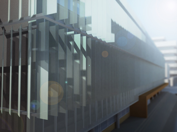
Updated Lighintg, Rendering and Composite
I try to compound two stages together in this test. Obviously, it need to be worked more in the metropolis lighting.

Tuesday, 19 July 2011
Test Lighting & Rendering
I was told that my previous key visuals are too bright and colourful for the mood and tone of the film. After the animation session, I've worked hard to explore what the film's appearance should be. For me, Autodesk Maya is still difficult to understand and time consuming, especially when I try to learn new things.
Anyway, I got this one after many attempts in lighting and rendering. It still needs an improvement. I will seek more tutorials.

EDIT: I have moved on to do test composite in order to check that all of render passes is enough. As you may see, it has a problem about lens blur. I'm going to fix it ASAP. Lacking of familiar AE plug-ins generates difficulties in getting what I exactly imagine.

Cheers,
WM
Sunday, 17 July 2011
Updated Animation
After providing feedback from Wayne and my colleges, I did the animation again based on those useful comments. At this moment, I am satisfied with it although it could be better if there is more time. During animation session, I found some difficulty in using animated texture. Fixing this MAYA technical issue is time consuming for me because of lacking 3D experience. Fortunately, I eventually got a good tutorial which solve the problem by using image sequence.
Anyway, the production must go on. The schedule said that time for animation has ended. Thus I have to keep moving to lighting process.
Cheers,
WM
Anyway, the production must go on. The schedule said that time for animation has ended. Thus I have to keep moving to lighting process.
Cheers,
WM
Saturday, 9 July 2011
Layout Animation
This is layout for doing music and sound. I also put some rough animation into it. I know that the animation is not much good, but I have one more week to improve it based on my timetable.
Key Visual 2
After getting feedback, I've improved key visual again to find the look in which the animation should look like. Several attempts were fail. Anyway, I eventually got satisfied version. I want to keep the feeling of children book and paper-like in this animation, so I avoid to make it too dark as the first attempts. I found that bright and colourful colours might be a good idea, but it is hard to control the overall mood & tone, especially telling night time.


Saturday, 11 June 2011
Key Visual
After I've finished rigging, I moved forward to key visual. The texture on environment is just quick, and not satisfied yet. Anyway, I'm waiting for feedback from Wayne.


Tuesday, 7 June 2011
Character Test Rigging
This is my first rigging for the project. I've spent a lot of time in learning this from online tutorials and Adam's advice. Although there is some problem in movement, It looks like a paper doll as I want. The errors are going to be fixed tomorrow.
By the way, rigging is a pain in my ass. :( There is a long way to go for my 3D animation. Keep fighting!

By the way, rigging is a pain in my ass. :( There is a long way to go for my 3D animation. Keep fighting!

This is my first time to animate 3D setup character. I'm still confuse with controlling joints.
Friday, 3 June 2011
Environment Mass and Character Update
This is the previous character design and paint. I almost finish this version before I was inspired from new sources of idea. Then I made a decision to redesign it again.

After recent few days of sketching, I've done the character design and initial texture painting. These are ready for doing modeling tomorrow.

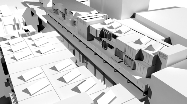
I also did the environment mass design. This metropolis is close to what I have been thinking for a while, massive skyscrapers on small island. The mass will be developed to more detailed version soon.


After recent few days of sketching, I've done the character design and initial texture painting. These are ready for doing modeling tomorrow.

I also did the environment mass design. This metropolis is close to what I have been thinking for a while, massive skyscrapers on small island. The mass will be developed to more detailed version soon.

Sunday, 8 May 2011
Architecture and Environment Design
In order to approach the idea of create environment through architectural aspect, I involved in architecture projects with master student at University of Edinburgh. Using V-Ray and Google SketchUp provide the better understanding in 3D lighting and building structures. Additionally, an opportunity to learn about architectural development is valuable, and might be useful for environment design in my own project due to its background, a future metropolis.
By the way, 3D techniques is my weakness. These project helps me to improve my understanding although they were made with different software.


Sunday, 20 March 2011
Pop-up Layout
I'm working on layout to experiment Kate's idea of using a match box instead of a book. Rigging made me sick... Anyway, I just did this quick test.
Thursday, 3 March 2011
Production Note - 2 MAR 2011
I've just got another keyword for my project in the reflection on practice class today. While I was focusing mostly in children book techniques and film theories, I forgot to be concerned studying about 'moral tales'.
On the surface, my animation is a story about a poor girl in a huge metropolis, but the actual message is concerning the value of everything. The girl is just a symbol in this case.
Thus I couldn't just focus on the narrative, but the way in which moral idea would be present. By studying other successful moral tales, I would get more into depth in how to enlighten audiences' perception. This means I've more work to do, but it would be very useful.
Tuesday, 1 March 2011
Environment Design Note
Regarding the last post about environment design concept, I'm researching about 'vertical city development'. In Bangkok, the vertical development doesn't affect only buildings, but also Infrastructure. For example, we have superimposed express ways throughout the city. Anyway, there is some city which is shirking too, or we may call it 'horizontal development', for instance, Detroit. According to this video (http://vimeo.com/1296775), the data illustrates how the city become smaller.
Dubai is very good example for building design. I studied Detroit because I want to understand more about the different between vertical city and horizontal one. Anyway, I have a shortage of experience in city development plan, and how infrastructure would be builded to serve the society. Thus I need more discussion with you.
In my mind, I've imagined about a metropolis which was builded on a small island, like Manhattan. It contains thousands building beside millions people. So the only way, in which people could live in the city, is going up to the air. In design aspect, this concept is respond to the animation's intention. However, I want to ensure that this idea have evidences to support.
Another idea has just came to me. Based on the knowledge of semiology, I think I could use the design of metropolis to represent the concept of society's classes.
I watched a film named the Fifth Element (1997) when I was a teenager. I think that the concept of production design is very interesting. The buildings have endless heigh. While nobility lives on the top floors of those buildings, middle class and poor one lives in the basements. The basements are foggy slum which covered by pollution. However, I'm not sure about the concept because it's very long time ago. So I'm going to search in the library to watch the movie again.
By the way, here is a good reference, 'Worth Enough?' by Radoslav Zilinsky.

Worth Enough? by Radoslav Zilinsky (2008)


Productiona Note - 1 MAR 2011
I discussed with Mark Grindle in the story and script class today. Same as Wayne's comment, he holds the view that the quotation in the end of the film is not necessary. The film could already tell the message itself.
I found that the value of my communication may regress by conveying message as texts due to the selected narrative methodology. While I have attempted to enlighten audiences' understanding on human's feeling level by throwing a question to them, the quotation may oppose this intention.
Mark also gave me a comment that I should be concerned on what is exactly ignored in the film, the girl or matches. The film's concept is referring to people who has skills or abilities which are not needed in societies. In symbolic aspect, the matches compare to shoes skills and abilities, while the girl is people. Thus the matched should be ignored in this case.
He said that I should add shots which make matches more meaningful, and show that people really need them at the end of the film.
Monday, 28 February 2011
Productiona Note - 28 FEB 2011
In regard to the individual tutorial today, I have to think seriously about a music composer, who could involve my project, and the technique, in which I may use. Actually, the current music in my animatic is fine. But I rather like to have more electronic sound in it due to the future setting. Wayne is going to introduce me to a girl who was in the team which made The Happy Duckling (2009). With her advice, I may found a good direction and a connection with a good musician.
Wayne also gave me comments for my animatic. He said that it's pretty good now. But I should aware a 'crossing the line' at thirty-third second. I perhaps solve it by slowly turning the camera's angle a 'wee' bit. He also think that the final sentences aren't necessary, audiences could understand the whole story and messages without them anyway.
Wayne also gave me comments for my animatic. He said that it's pretty good now. But I should aware a 'crossing the line' at thirty-third second. I perhaps solve it by slowly turning the camera's angle a 'wee' bit. He also think that the final sentences aren't necessary, audiences could understand the whole story and messages without them anyway.
Thursday, 24 February 2011
The Crowd Solution
Regarding to the crowd problem in which I found last time, I've just got an idea how to solve it. Based on my previous work experience in Kantana Animation Studios, I found that I could greatly reduce 'production cost' by planning carefully about the scale of pre-production. Instead of making four extra characters, I could make just one by replacing some difference accessory, such as hat and scarf, beside changing a few texture.
I discuss this with Adam today to ensure about shared rigging. He said that it's possible. This may lead to my final decision on technique which would be used on my project.
The crowd simulation concept is very suitable. We used a software called Massive in Khankluay 2. Anyway, I think I'm not going to use a simulation software in this case because it's too expensive in production aspect. The maximum is 12 characters in a shot. Just Animation may be enough.
Tuesday, 22 February 2011
Initial Pixie Sketches
Since the last Christmas, my script have been changed from the old shepherd to the little candle girl. Thence it changed to the little match girl finally. These are initial Pixie, the main character, sketches. I found that they aren't satisfied yet because they look too lovely. According to the story, Pixie is a homeless girl. So she should look more poor.


The Little Match Girl (The Little Candle Girl) - Character Sketch

The Little Match Girl (The Little Candle Girl) - Character Sketch
How Should a Metropolis be in Next 50 Years?
Now, I've moved to the environment design process. The animation use a future metropolis as its backdrop. So I'm researching that how the city should be.
Personally, I believe that a future metropolis tends to be builded by using more space in the air, for instance, buildings would be very high, and have very thin basement but broad roof-deck. Although nobility may be interested moving to the countryside in the present days, middle class tends to be more interested to live in the city centre due to convenience. I think this concept would continue to the next decades, and affects the city development plan.
Personally, I believe that a future metropolis tends to be builded by using more space in the air, for instance, buildings would be very high, and have very thin basement but broad roof-deck. Although nobility may be interested moving to the countryside in the present days, middle class tends to be more interested to live in the city centre due to convenience. I think this concept would continue to the next decades, and affects the city development plan.
The Direction Problem
I'm planing about which technique is most suitable for my project. Three-dimension would be a great choice for my future because I would understand better in unfamiliar field. Anyway, it will come with a ton of pre-production jobs.
After have a discuss with Adam, I found that a crowd in the animation is a big problem. I need a least four extra characters for those shots. However, he said that I could solve the problem by repeating a same character for the citizen. It depend on the design and style which will be used. This problem may affect the design direction.
After have a discuss with Adam, I found that a crowd in the animation is a big problem. I need a least four extra characters for those shots. However, he said that I could solve the problem by repeating a same character for the citizen. It depend on the design and style which will be used. This problem may affect the design direction.
The Little Match Girl - Animation (version 1)
The Little Match Girl - Animation (version 1)
Here is my project's animatic. I wonder if you could help me develop it by leaving comments.
I had planed to make my animation shorter than a minute before I found that the shortage of time leads to difficulties in narrative. Although audiences could understand the main message of the story, a considerable number of them was confuse in details. Adding more few shots could illustrate the details more clearly. Thus the time has been extended to a minute and half which means more works.
The animatic used free foley and music from http://www.freesfx.co.uk/. I am looking for a sound and music composer who wants to involve my project. If you are interested, please let me know.
Subscribe to:
Posts (Atom)